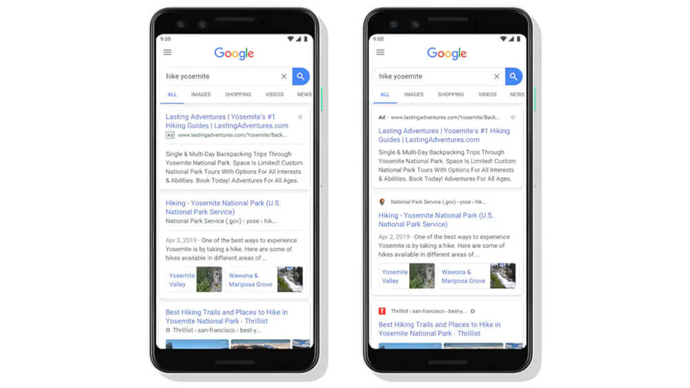
Google has rolled out a new look for the search results page on mobile devices that puts the branding of websites front and centre. The search giant says the change is aimed to help the consumer better understand where the information is coming front. The revamped design is available now to a limited number of users and will reach all over the next few days. There is no word on when a similar design will be available for desktop users.
“With this new design, a website’s branding can be front and centre, helping you better understand where the information is coming from and what pages have what you’re looking for,” Google wrote in a blog post.
According to the Mountain View, California-based company, with the new design, the name of the website and icon will appear at the top of a results card, followed by page title and the description of the page. Earlier, the page title would appear at top, followed by the URL or website name, and the page description.
Additionally, the advertisements will now be accompanied a bold ad label, instead of the previous green label. The ad label will show up in the place of the website icon (favicon) on advertisements.
Google also says the updated design will give it an opportunity to add more useful action buttons to the search results.
“As we continue to make new content formats and useful actions available—from buying movie tickets to playing podcasts—this new design allows us to add more action buttons and helpful previews to search results cards, all while giving you a better sense of the web page’s content with clear attribution back to the source,” Google wrote.
Apart from the new design, Google is working to bring several more changes to the mobile search over the coming months. The company had previewed some of these changes like AR search results and full coverage for news results in search.

